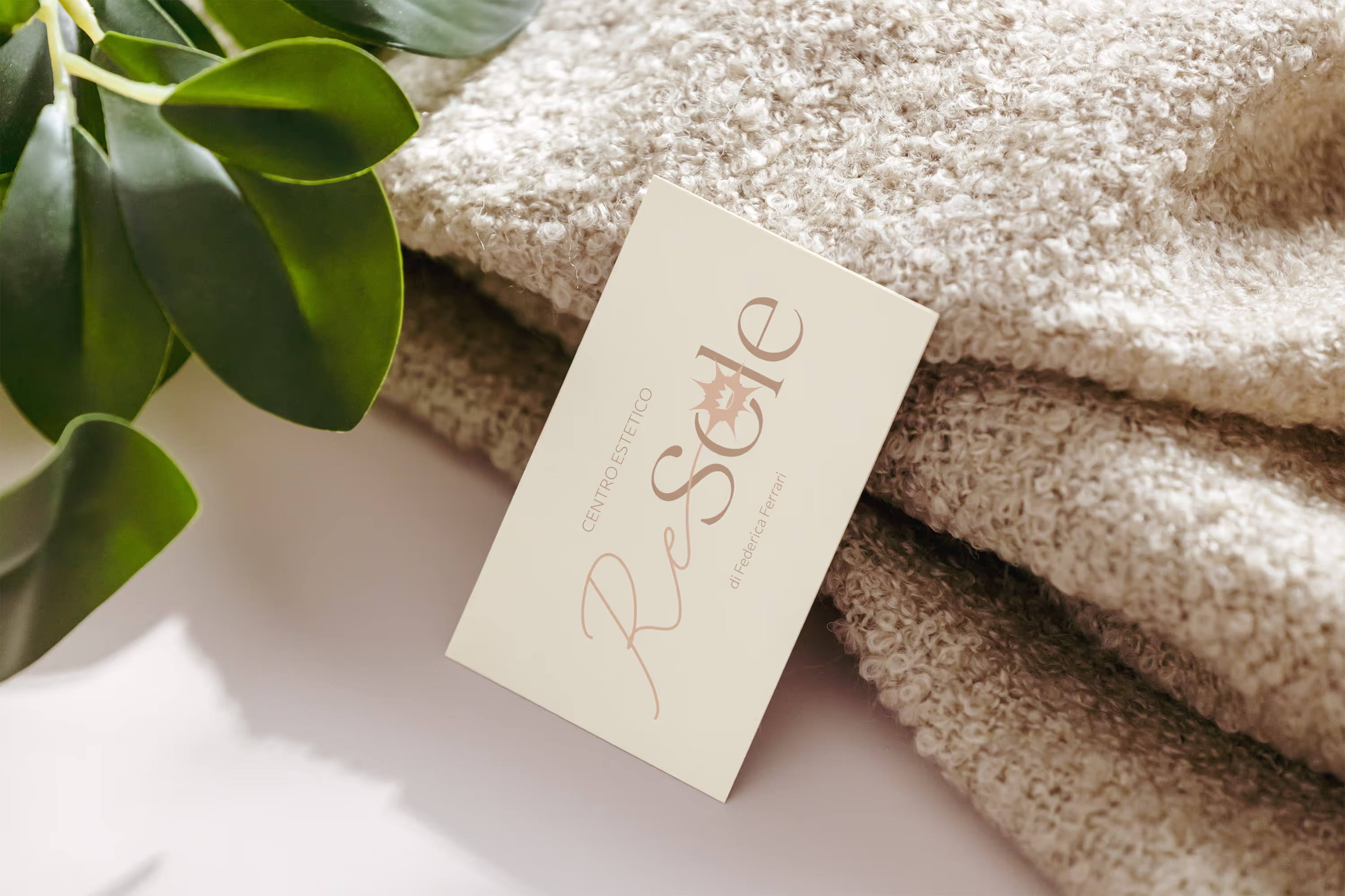
It is a small beauty center that has been in business for over 20 years and lacked a real visual identity. Not having a defined and coherent identity, it was very easy to mistake it for a competitor that has the same name.
Year: 2025
Project: Visual Identity

This brand design project proved to be essential to be able to make the Re Sole beauty center stand out from the competition. We created a new logo, chose a color palette and a typography in line with those who lead the brand so that Federica would feel represented by this new corporate image, developed tailor-made for her and her brand. Now the Sun King is able to stand out and shine compared to the competition.